Memorieslab
THE CLIENT
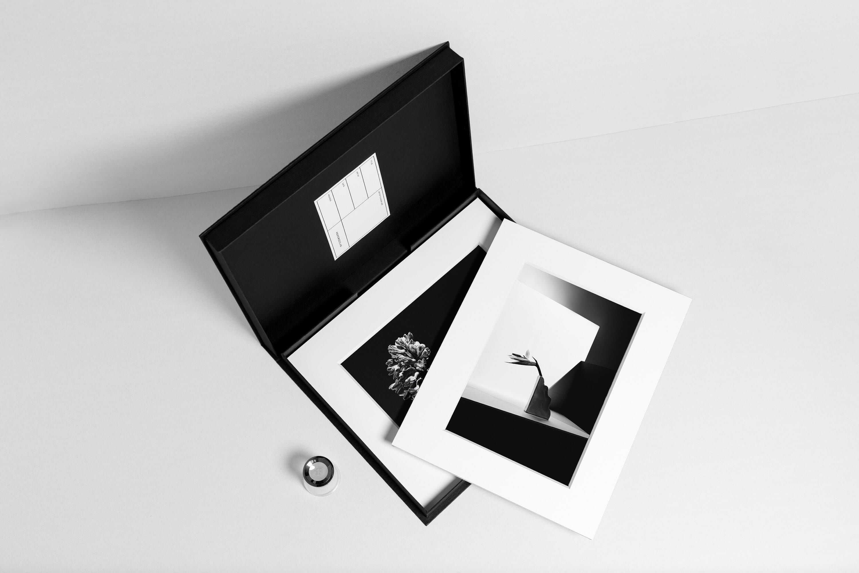
Memorieslab is an acclaimed creative company that offers photography, print production, and art retail solutions for global premium-level consumers. From boxes of beautiful prints, stunning monochrome albums, to museum grade fine art prints. By applying hand-perfected classic techniques, Memorieslab is dedicated to the exploration of the best photographic preservation.
LOCATION
Shanghai, China
SCOPE OF WORK
Brand Strategy
Brand Identity
Stationery & Collaterals
Brand Guidelines

THE OBJECTIVE
The objective was to create a high-end look for the newcomer in the market. Memorieslab asked to visualize and conceptualize the excellent quality of their photographic print products while developing the characteristics of a lifestyle brand.
THE SOLUTION
While developing the brand identity, we were driven by the notion that Memorieslab’s spirit is tightly tied to the world of photography. Due to that, the logotype and occasional red accents within the branding are inspired by the typefaces used on vintage cameras, the symbol ‘M’ represents the film roll, and the silver brand patterns mimic the chemical processes of the traditional photo production in the laboratory.
The color scheme of the identity – clean, minimal black and white was chosen considering the fact that high-quality monochromatic photography products are one of the core offerings by Memorieslab.


